반응형
Apple Logo Design
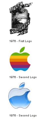
Based on its company name, they selected an apple as its main form of branding. Initially, the logo depicted a small apple shape sitting under a tree with Apple Computer Co set into the frame of the picture. It is this apple that has continued to be used. The first logo design was perceived to be a bit too complex and hard to view, so Regis McKenna worked on the logo some years later and added a "bite mark" to symbolize the concept of seduction of the customers and the marketplace in general. Next, the monochrome version was replaced with the rainbow-colored logo as a reference to the Biblical story of Adam and Eve in which the apple represents the fruit of the Tree of Knowledge. It brings to mind that people must pursue their dreams. While this was not initially a deliberate goal, it did encourage business and consumers to consider the Apple brand for the first time and was successful in generating increased profits.
http://www.logoorange.com
반응형
'Design story' 카테고리의 다른 글
| BMW company logo design (0) | 2008.05.26 |
|---|---|
| Adobe Logo Design (history) (0) | 2008.05.26 |
| Series of Posters done in 2005 (0) | 2008.05.08 |
| 음주 운전 (0) | 2008.05.01 |
| 나미로빈 : 스포츠 광고도 튀어야 산다!! 독특하네~ (0) | 2008.04.27 |